Consistency is the most important thing in practicing calligraphy
The more I am on this journey the more I believe in the importance of the basic principles in calligraphy, and they can be sum up into this one thing— consistency.
Mainly, consistency in the four S’:
• The stroke width. Are your upstrokes all equal or similar in their thin-ness? Are the downstrokes all equal or similar in thickness?
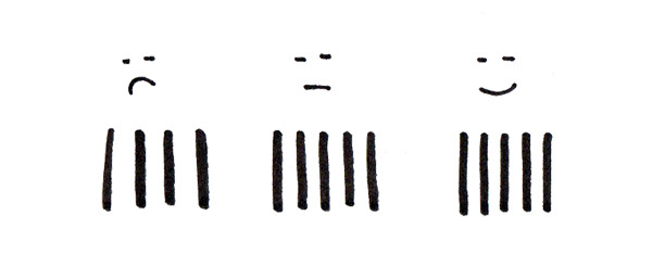
• The size. Are the letters consistent in size? I know this one is debatable when it comes to modern calligraphy, but that’s for another email!
• The slant. Are your letters all have the same slant?
• The spacing. Are the letters spaced evenly, visually speaking? Are the spaces between words consistent?
When you spot a beautifully written calligraphy, look beyond the flourish, the color, and the embellishment, and I bet you will see these principles.
It takes time and consistency to master calligraphy. But I believe there is a quicker way of getting good at anything. And that is knowing:
1. What is good and what is bad
2. Why it is good or bad
3. How to make it good and better
Most of the time we know what’s good and what’s bad, sometimes we know why, but knowing how to fix it is the challenging part. So in this post, I will try to tackle each area and hopefully lend some insight.
1 – Calligraphy Consistency in the stroke width
I am pretty sure you know that what makes calligraphy different from regular writing is in its thick and thin strokes. But more so, it’s the consistency in the stroke width. That means the thick strokes should be the same thickness and the thin strokes should be the same thin-ness.
To achieve that uniformity, we will need to apply the same amount of pressure every time we do a downstroke. The easiest way to practice this is to do the basic stroke practice.
Now, I know that it’s impossible to write like a robot and produce the exact same stroke every time, but we can always improve and there is no limit to that.
I want you to pick up a pencil or a brush pen and draw some down-strokes. Start with a short stroke and repeat it a couple of times. Take a closer look at your down-strokes, are they straight? Are they equal in stroke-width? Can you draw longer strokes and keep them looking almost identical?
Here is some demonstration of what I meant by “having the same stroke width.”
Next, do the same with up-strokes. You might find it easier because you don’t have to apply pressure as you write and therefore easier to control the pen.
Finally, write a capitalized word and see if the stroke width is consistent throughout the word.
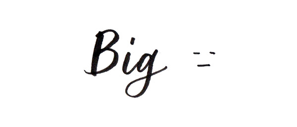
the downstroke of the B is much thicker than that of the “i” and “g”.
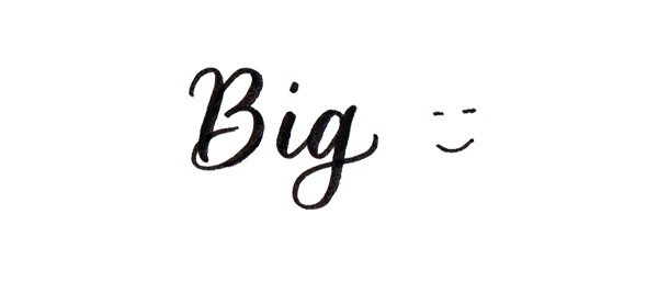
The downstrokes are the same in thickness.
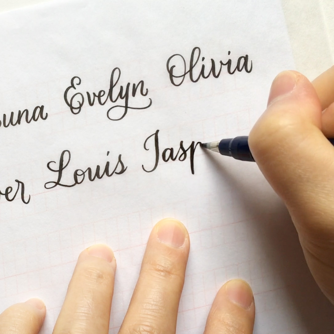
2 – Calligraphy Consistency in letter size
I would suggest if you are just starting in learning calligraphy and lettering, spend some time learning the traditional styles and do things the old school way. By that I mean instead of jump right into the bouncy lettering, gain a good understanding of the classic penmanship first.
Copperplate and Spencerian are two styles worth spending some time learning. It’s a little bit like a singer learning the original melody of a song before she starts improvising and scatting. Like when Picasso said, “Learn the rules like a pro, so you can break them like an artist.” Once you know the rules you’ll know why you want to break it.
The size of the calligraphy letters should have enough similarity to please the eyes and enough variation to make it interesting. How do we achieve that? I think the variation part is easy since we are not robots and our natural handwriting will have enough variation. It’s the similarity part that takes time to develop.
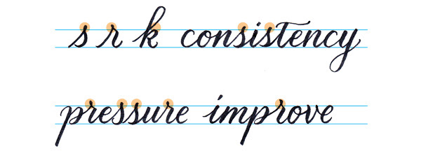
We can start by making sure the height of the letters is consistent; the x-height of the letters should all be the same. And fortunately, we can develop this muscle memory by practicing on a guide sheet whenever possible.
Note the letter “r” and “s” should peek above the waistline and the “shoulder” of the letter “k” should touch the waistline.
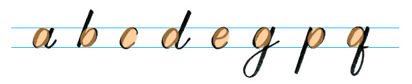
As far as the width goes, letters that have similar form should have the same size. The letter “c”, “e”, “o”, and the counter (the oval shape) of “a”, “b”, “d”, “g”, “p”, “q” should all be the same size.
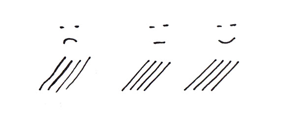
3 – Calligraphy Consistency in letter slant
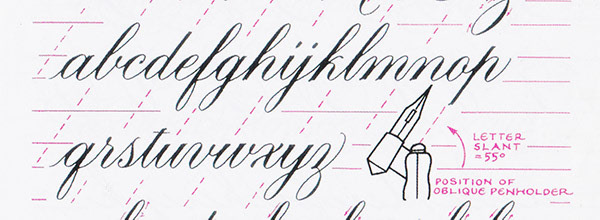
In traditional calligraphy, each style has its distinctive slant. For example, the standard Copperplate has a 55-degree slant and the Spencerian has a 52-degree slant. In Italic style with the broad-edge pen, the letters slant 5 to 7 degrees. You see, each style has its own unique set of characters and the slant is very specific.
When it comes to modern calligraphy, there is much more room for experimentation and personal preference. For me, unless I am writing for some formal occasions, I typically don’t write in the 55-degree slant. My go-to brush pen calligraphy slant is 75 or 85, I think they look friendlier than the 55 degrees and more comfortable to write. But whatever slant angle you prefer, I would suggest you practice with the guide sheet to stay consistent.
The letters slant is most obvious in the ascender and descender. There are a couple of ways to exam the slant of your writing:
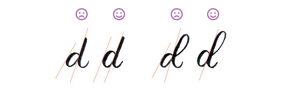
• First, write a “d” without the loop, the tangent of the bowl should be parallel with the stem. (Bowl is the oval part of a letter and stem is the main vertical element of a letter. )
• Second, write another “d” with a loop, do the stems of both ds have the same slant?
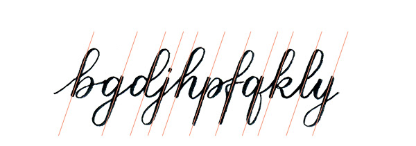
Write out all the letters with ascender or descender (b, d, f, g, h, j, k, l, p, q, y) and see if they all have the same slant? They should be like the flagpoles outside of the UN!
Here are some ways to practice producing consistent letter slant:
• Always practice with a guide sheet with the slant guidelines.
• Write out all the letters with ascender or descender on one line and be mindful of keeping the same slant.
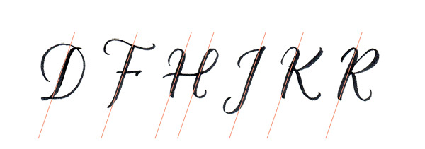
• Don’t forget to practice the uppercase letters as well, especially the letters with a prominent stem.
I promise you, having a consistent letter slant is going to dramatically improve your writing!
4 – Calligraphy Consistency in letter-spacing
Spacing is tricky and it does take a lot of practice and experience to be good at it, so if you are struggling with the spacing issue you are not alone!
Before we dive into the technicalities of letter-spacing, I’d say generally you want to have more letter-space in calligraphy writing as supposed to typical casual handwriting. Because in calligraphy there are thick and thin strokes as supposed to the monoline produced by regular pens.
I am going to tell you a secret, most of the spacing issue can be solved by understanding how to create consistent spacing between curves and straight-lines and make them look like they cover the same amount of surface area. Here are the possible combinations:
1. Straight-line to straight-line
2. Straight-line to curve
3. Curve to straight-lines
4. Curve to curve

If you know how to make these 4 shapes look similar in surface area, then you are on your way to producing consistent letter-spacing.
How to practice:
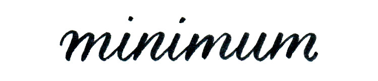
• Straight-line to straight-line: let’s first practice how to create consistent straight-line to straight-line spacing by writing the word “minimum”. This is also a good word to practice consistent letter slant!
• Straight-line to curve: after you’ve established a consistency letter spacing in the word “minimum”, try “minimal” “immune” or “mindful”
• Curve to straight-line: now try “minion” “intelligent” or “multiple”
• Curve to curve: lastly, let’s write “community” or “multicolor”
Compare the with the spacing in the word “minimum” and see if they are consistent.
Pro-tip 1: leave a little bit more space when the following letter is a, c, d, g, or q. The reason being, most of the time we underestimate how much space is needed for letters with a starting point on the right.
Pro-tip 2: On the other hand, the letters b and p end on the left, so your pen needs to travel further to connect to the next letter.
Ex.: brown (br), pray (pr), and peace (pe)
Pro-tip 3: For letters that have open-boundary such as c, e, r, s, and t, remember not to neglect proper spacing around them. It is usually wise to give it just a little bit more space than you think. Especially when you write “cl” in any word if there is not enough spacing it can be misread as “d”. If you are writing the word “clear” leave enough room so it won’t read “dear”. Some words to practice:
Ex.: actor (ct), chimney (ch), inclined (cl), together (et), street (str), uniform (or), shimmer (sh), secret.
It’s really hard to explain letter-spacing in words, so I highly recommend you to check out this video I made for you!